How to get a Block Caret in Visual Studio
TLDR;
While Visual Studio does not support a Block Caret for normal mode, you can write an extension for Visual Studio to get a Block Caret, which I did and published here.
Philosophy
So I am big fan of continuous small improvements that add up over time, which includes any investment into the developer inner loop. But the pursuit of tiny gains holds a danger of it’s own - it can lead the unwary traveller astray and into rabbit holes that one may not reappear from quickly - should they be deep enough.
In case I may be biased, hence the name of the domain, I let you dear reader, be the judge if this story falls into the former camp or the latter.
What’s with the Block Caret?
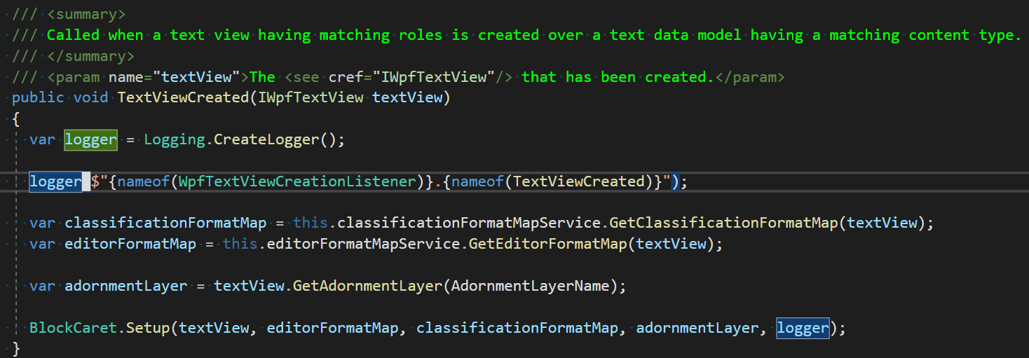
Maybe it’s because I am getting older or maybe it’s because I’ve recently upgraded to a 32” 4K Monitor, I found the visibility of the default Visual Studio caret lacking, as shown in the the following screenshot:

While it’s certainly not impossible to find the caret that sits right after the second logger, it’s certainly not obvious and takes some mental effort.
I noticed that I’ve grown very fond of the block cursor type combined with a color that has a high contrast to your used color scheme - an approach that I’ve used in vscode to great success.
For me, this approach improves upon the easy discoveryability of a blinking cursor by ridding it of the blinkrate’s time-delay and replacing it’s distracting nagging with the serenity I’ve grown accustomed to by the line cursor.
You can take a look at some cursor types that are available in vscode and try the out by hovering over their names on the right.
Cursor on a Word
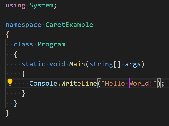
I found the visibility of a specific cursor type depends on the character it sits on. For example, the visibility of most cursor types decrease dramatically if the caret sits ontop of a bracket, the only saving grace is the aggressive color of the caret.
Cursor on a Bracket
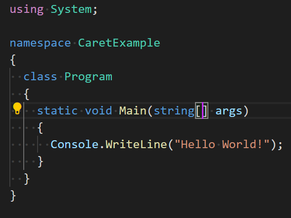
The specifics will of course depend on a lot of factors, including the programming language and font used and so on, but in general the bigger the highlighted area and the higher the contrast the more visible it will be.
The search begins
To my dismay, I found no such feature in Visual Studio, well with the exception of the override mode, which looks the part, but is useless to me due to the behavior change it introduces. The override mode is IMHO a mostly useless remnant of that IDE’s barbaric past, just like the tailbone in humans - and about as useful, YMMV of course.
So I looked into several other options:
- Cursor Thickness
- Text Cursor indicator
- Visual Studio Extensions
Cursor Thickness
Then there is a system-wide setting for Windows that controls the thickness of the cursor that Visual Studio also respects:
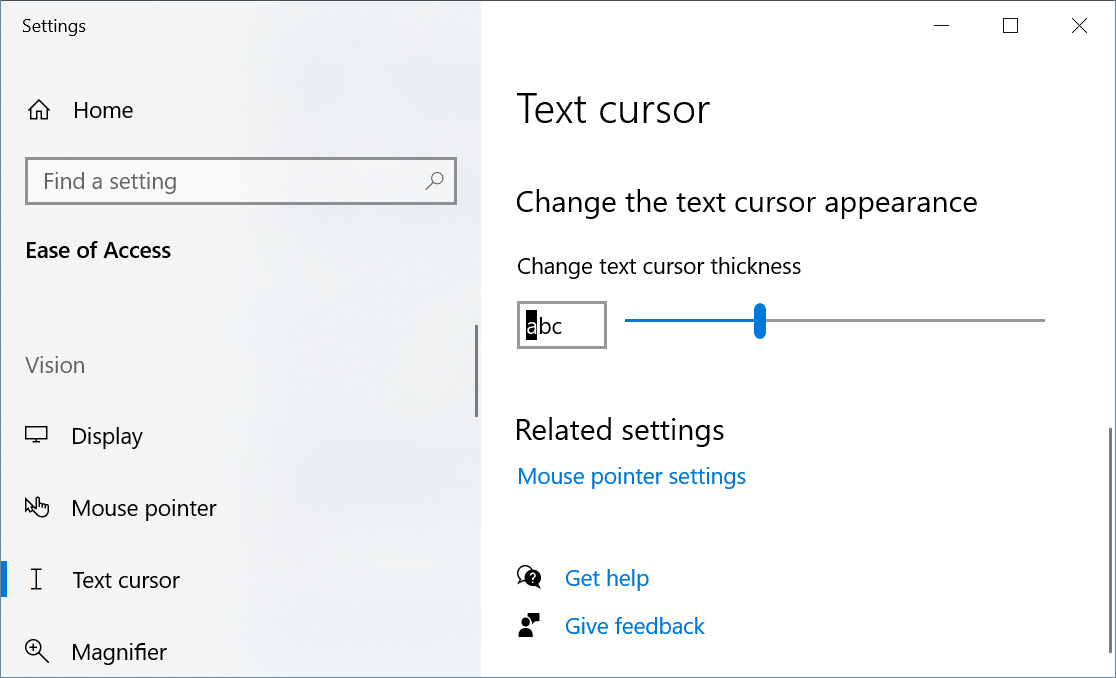
The problem with that setting is that the color of the cursor is based on the “Plain Text” color and drawn with 100% opacity and so it obscures the character it currently sits on, which is… an interesting choice of implementation and the result is accordingly disappointing:
Text cursor indicator
In a recent windows build, a new Feature named Text cursor indicator was introduced, which sets out to solve exactly the “problem of the lost cursor”.
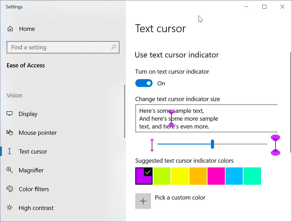
When turned on, it looks like it’s working and the indicators appear as shown in the following screenshot:
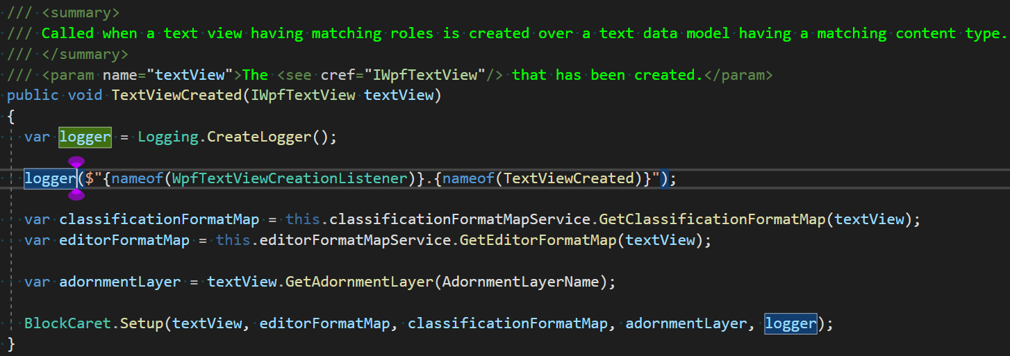
The problem is, that it stops working as soon as you scroll (using the mousewheel or a keyboard shortcut) or use Go To Definition - what a bummer!
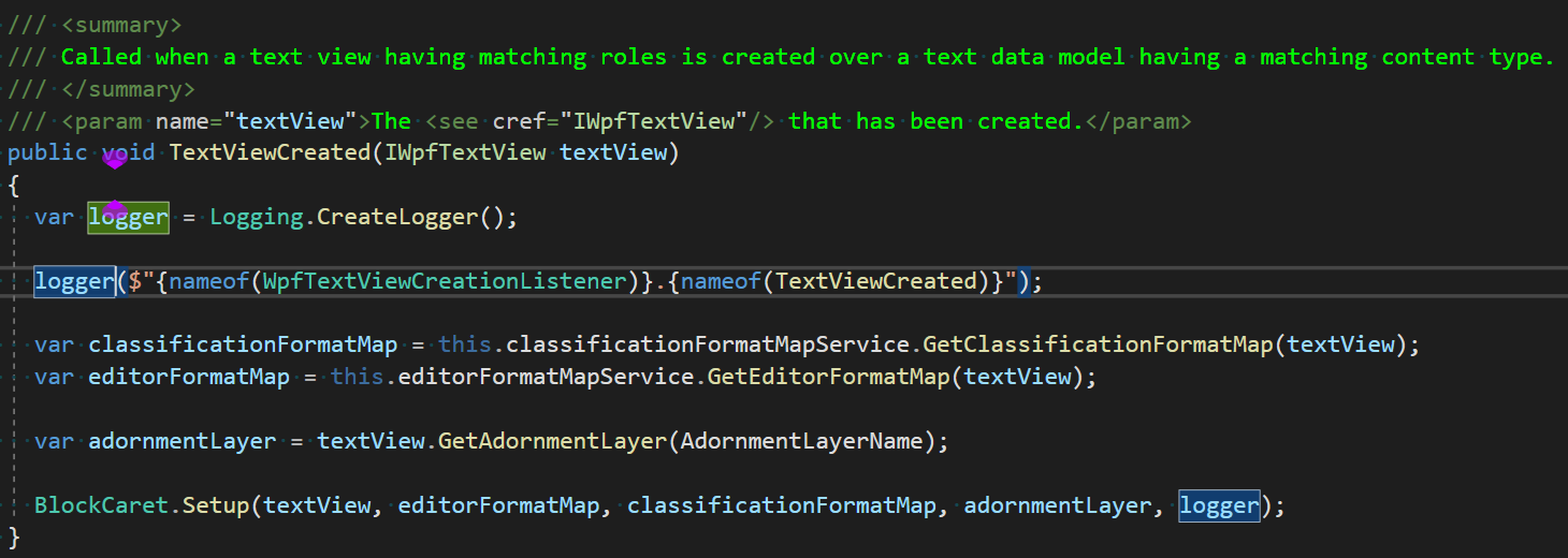
If it would actually work and could be restricted to apply only to certain applications, it could be a viable solution.
Visual Studio Extensions
While I didn’t find any extension that solved the problem out of the box, it bears mention that there is a very popular Visual Studio Extension that adds Vim support to Visual Studio called VsVim. As part of it’s Vim implementation it also implements a Block Caret for normal mode, as is custom for Vim. While I do think that Vim is a great solution for text editing and I use it actively, I find I am more productive with a different setup when writing code.
Thanks to Jared Parsons (@jaredpar), the author of VsVim, who graciously OpenSourced the extension, I was able to gather enough information to figure out how he does that. The logic of rendering and updating the caret is rather straightforward and what you would expect, basically you hide the original caret and add your own vanilla WPF Controls (e.g. Canvas, Rectangle, TextBlock) to an AdornmentLayer and move them around as soon as something changes. But interfacing with Visual Studio was the tricky part and I am sure having the code available saved me lot of time (there is an especially arcane part for accessing the AdornmentLayer).
Visual Studio Extension: BlockCaret
Armed with that knowledge I finally could write a very simple extension from scratch that implements a Block Caret with the result below:
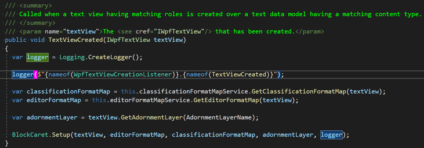
I’ve published the extension, so if you are interested you can try and download it from here or search for ‘BlockCaret’ in Visual Studio Extensions.
References
Text Cursor Indicator (https://docs.microsoft.com/en-us/windows-insider/archive/new-in-20H1#text-cursor-indicator)
Block Caret (https://marketplace.visualstudio.com/items?itemName=MartinKramer.BlockCaret)
- VsVim Github Page (https://github.com/VsVim/VsVim)
VsVim (https://marketplace.visualstudio.com/items?itemName=JaredParMSFT.VsVim)
Text Cursor Indicators (https://docs.microsoft.com/en-us/windows-insider/archive/new-in-20H1#text-cursor-indicator)